
Five dimensional scatterplot using ggplot2
“How many dimensions can you show on a scatterplot or a chart?” is a question that often pops up in many situations, for example, data scientist interview. This question came up also in my workplace. My colleagues were of the opinion that five dimensions would be a bit too much for a two-dimensional scatterplot. Here, I write a simple code in R to plot five dimensions in a two-dimensional scatterplot. Along with the five dimensional scatterplot, I will also add few manipulations to the figure produced by ggplot for better (?) visuals.
First let us load the libraries needed for the script
library(ggplot2)Next, we create a five dimensional dataframe. We will use two continuous variables for the two axes and three categorical variables to display different classes in the data. Since, we use rnorm function to generate random points use set.seed() function to set the seed to get exactly same sequence of numbers. This is important for reproducibility of the code.
set.seed(123)

dat <- data.frame(status = rep(c("Single", "Married"), each=10),# conditional categorical variables
                  height = 41:60 + rnorm(20,sd=3), # variable for the x-axis
                  weight = 41:60 + rnorm(20,sd=3), # variable for the y-axix
                  Education = rep(4:8,4),  # A numerical but categorical variable determines the size of points
                  gender = rep(c("Male", "Female"), each=2))  # gender to display in the plot)
Now, we use ggplot function from ggplot2 package. The most important parameter of ggplot is a function aes. The aes is often called as aesthetics and it maps variables to different parts of the plot. It takes as input x-axis, y-axis and other formatting options.
dat.plot <- ggplot(dat,
   aes(x=height,  #  height as x-axis
   y=weight,  #  weight as y-axix
   shape=status, #  shape denotes marital status
   color = gender, #  color denotes the gender
   size = Education))   #  size denotes the education
The aes function only creates the aesthetics but we need to add a layer of points using the aesthetics mapping. The function geom_point() does exactly that.
dat.plot <- dat.plot + geom_point() We can change labels in both x-axis, y-axis and title using:
dat.plot <- dat.plot +  xlab("Height")                             # add xlabel to plot
dat.plot <- dat.plot +  ylab("Weight")                             # add ylabel to plot
dat.plot <- dat.plot +  ggtitle("Five Dimensional Scatterplot")    # add title to image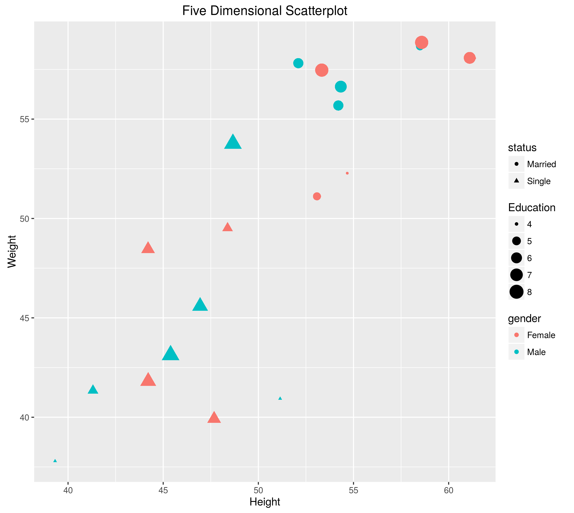
Figure 1: First Five Dimensional Scatterplot
This creates a plot like the Figure 1 above. Figure 1 shows five dimensions in two-dimensional scatterplot. We have used glyphs, shapes, and color to add further three dimensions to the scatterplot on top of the regular X and Y axis. However, we can put the legends inside the plot, as the left-hand side of plot is free. We can also use the theme argument of ggplot2 which changes the themes of the plots.
# Put bottom-left corner of legend box in bottom-left corner of graph
dat.plot <- dat.plot + theme(legend.position=c(0,0), #position the legend
                             legend.justification=c(0,0)) #justification of legend
# bottom-left is 0,0; top-right is 1,1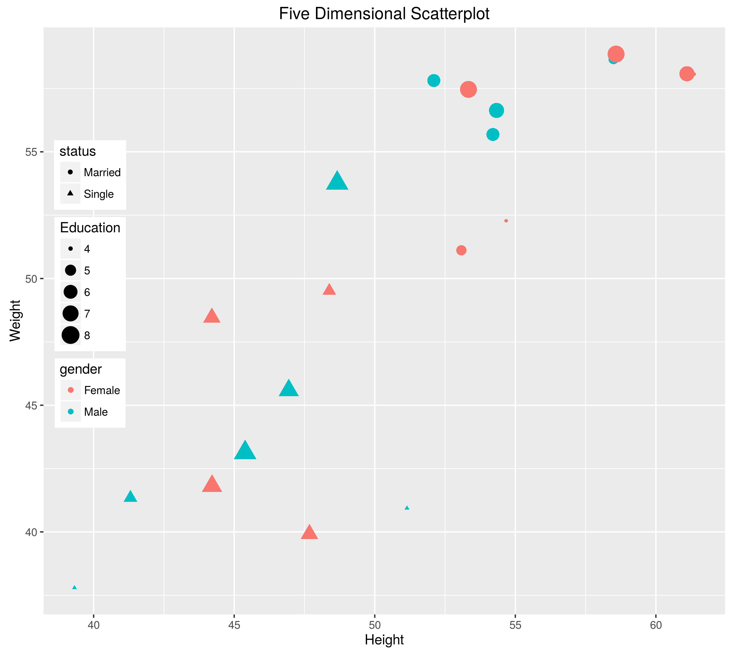
Figure 2: Second Five Dimensional Scatterplot
This creates a plot shown in Figure 2, however, Edward Tufte, would still be not happy because the gray color of the background ggplot still takes some ink so data to ink ratio is decreased (Actually, it is my personal preference that plots have white background). We also can increase the font size of titles and X and Y labels. Also lets improve the readability of the plot with larger font sizes for axes and titles.
dat.plot <- dat.plot +  theme(legend.position=c(0,0.3),
        legend.justification=c(0,0),
        panel.background = element_rect(fill = "white", #background color of the plot
        colour = "black",  #color of the rectange around plot
        size = 1, linetype = "solid"), # Line type and width of lines of the rectangle around the figure
        axis.title=element_text(size=18,face="bold"),  # fontface and font size of both X and Y labels
        axis.text=element_text(size=14), # ticklabels of of both X and Y axes
        plot.title = element_text(size = rel(2), # Title of the plot
        face="bold", colour = "black"))  # Color and fontface of the title
We now change the titles of legends in the plot through scale_color_discrete and scale_shape_discrete.
dat.plot <- dat.plot + scale_color_discrete(name ="Gender", labels=c("Female", "Male"))
dat.plot <- dat.plot + scale_shape_discrete(name="Marital\nStatus", labels=c("Married", "Single" ))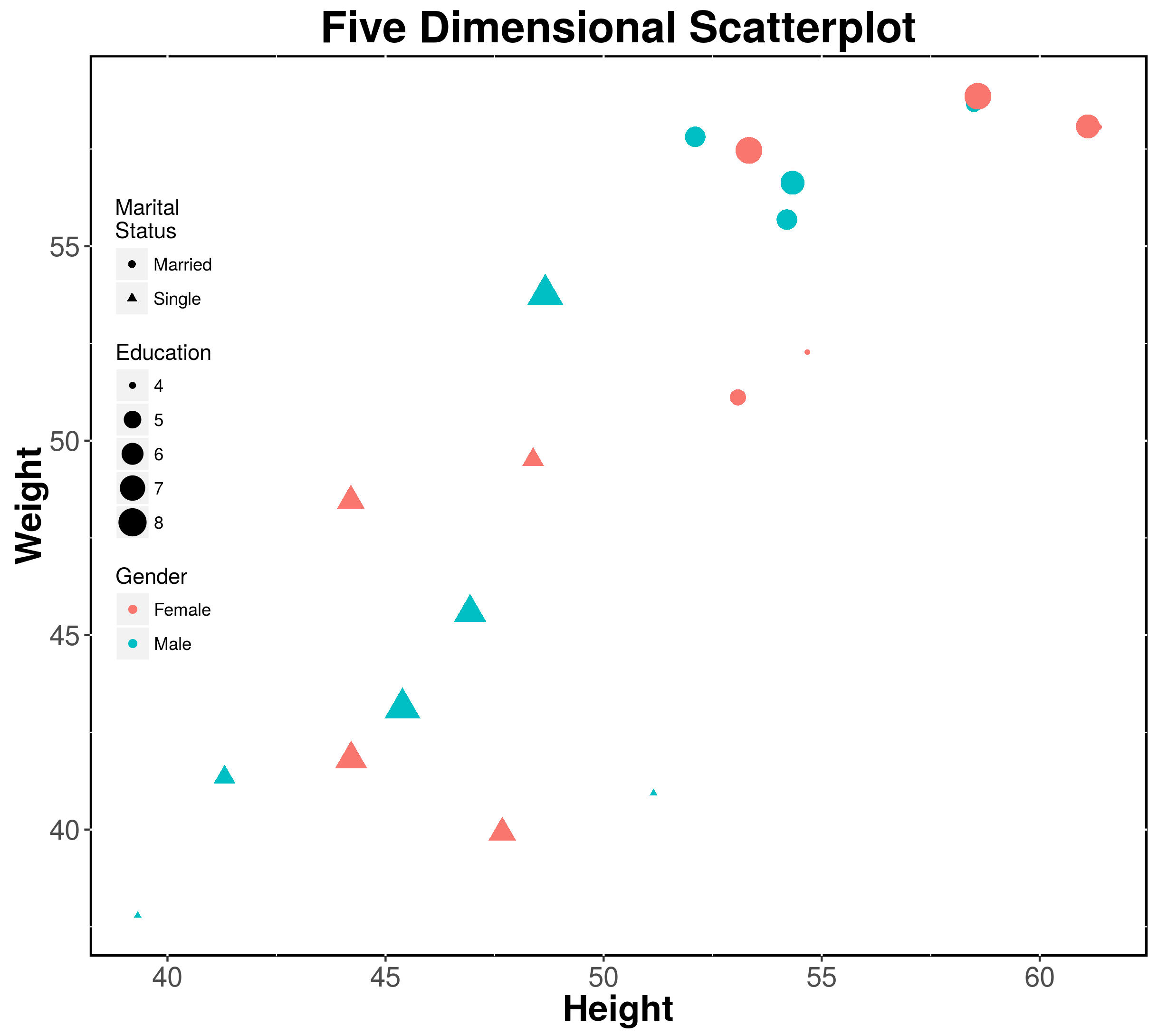
Figure 3: Third and Final Five Dimensional Scatterplot
The final plot is as shown in Figure 3, which seems better than the first one. The code is available from my Github page.